Services
Brand Identity Development
Visual Alignment with Merger Brand
Brand Tool-Kit Creation
Brand Identity Development
Visual Alignment with Merger Brand
Brand Tool-Kit Creation
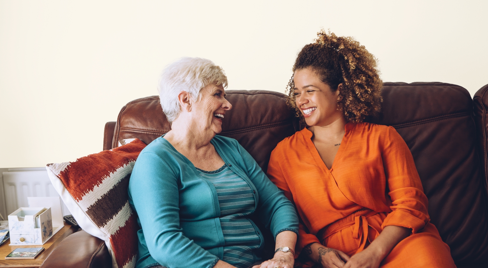
Affordable living for younger people & our ageing population is facing an increased sense of loneliness resulting in damaged health.
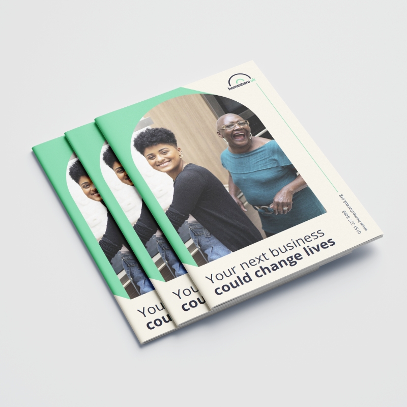
Creativity and innovation in developing brand identities and communication assets. Create unique and visually appealing designs that effectively communicate the client's values and mission.
User-centered approach to their work. Aim to create designs that resonate with the target audience, ensuring that the brand identity and communication assets speak the same language as the client's values.
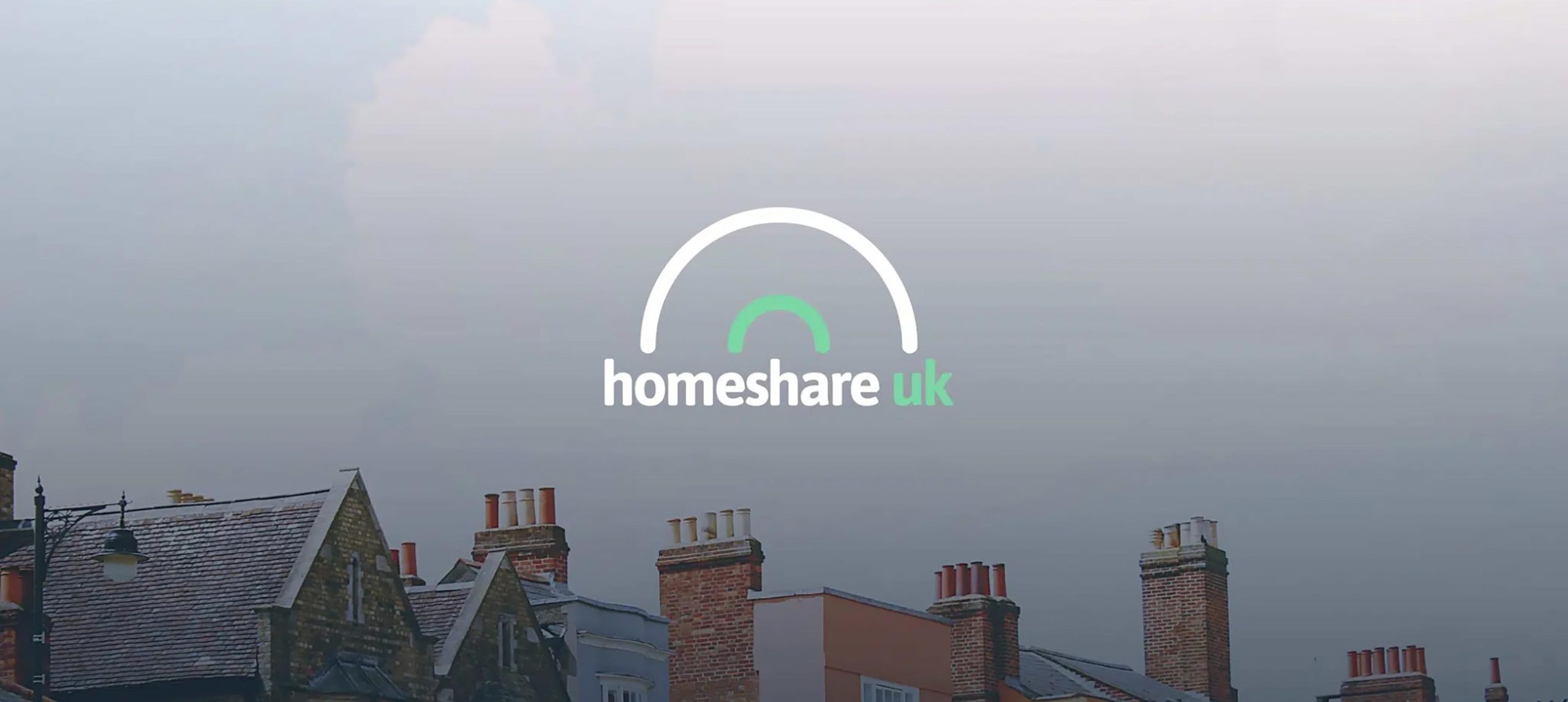
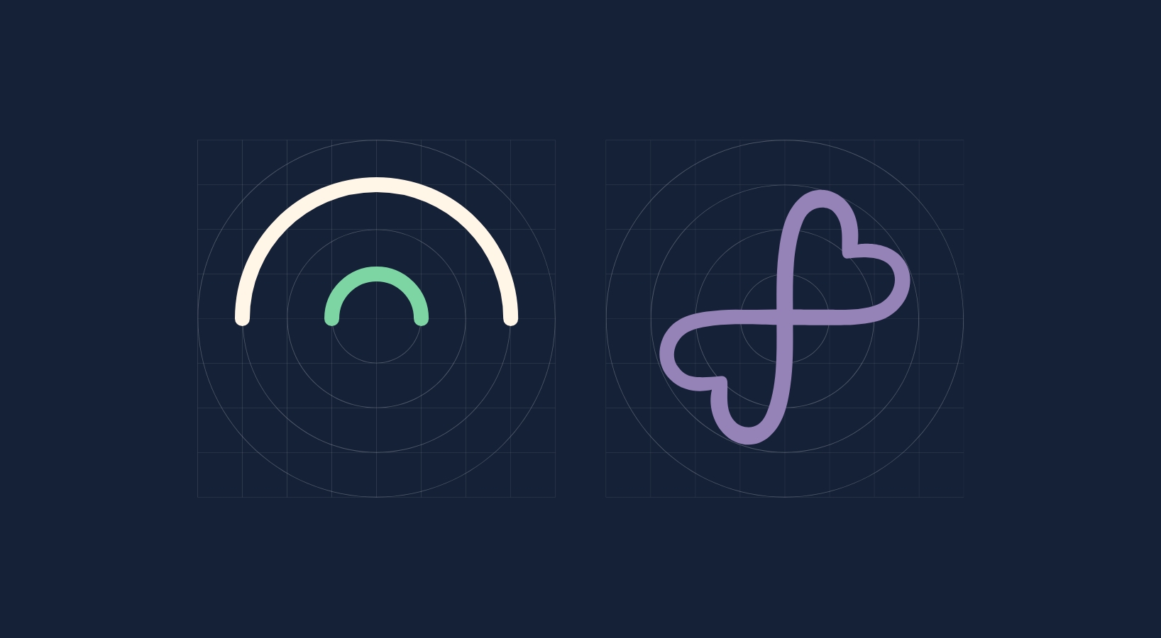
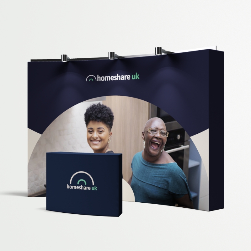
The creative team successfully developed a new brand identity for Homeshare that visually connected with the Shared Lives Plus network while also standing out as a unique entity. They used the line of the Shared Lives Plus brand marque as a device to weave the two brand identities together, creating a cohesive visual representation. The new Homeshare brand marque incorporated elements representing a rainbow, two homes together, and a bridge, symbolizing the concept of bringing people together through home-sharing.
Through stakeholder engagement during the project, the creative team ensured that the brand development process was authentic and representative of Homeshare's values. The resulting brand toolkit provided clear definitions of the identity process and its relationship with the partnering department, Shared Lives Plus. The new brand identity for Homeshare successfully achieved its objective of visually speaking the same language as Shared Lives Plus while reflecting its unique values and mission, creating a coherent and visually aligned brand family within the Shared Lives Plus network.

Invite us to pitch, tender or consult. We'd love to get to know you. We are passionate about seeing your potential as an organisation reached.