Services
Brand re-discovery
Stakeholder Co-Design
Brand Identity Creation
Touch-point Asset Delivery
Brand re-discovery
Stakeholder Co-Design
Brand Identity Creation
Touch-point Asset Delivery
The NHS is struggling to support its patients that are near their independence but not quite ready. It also needs to reduce the number of active hospital beds as a way of saving on resources.
The new brand identity and tone of voice piece has re-energised the charity greatly, bringing it into the modern world gracefully. It has contributed wonderfully to its growth, receiving national press form the BBC and ITV, as well as the attention of parliament.
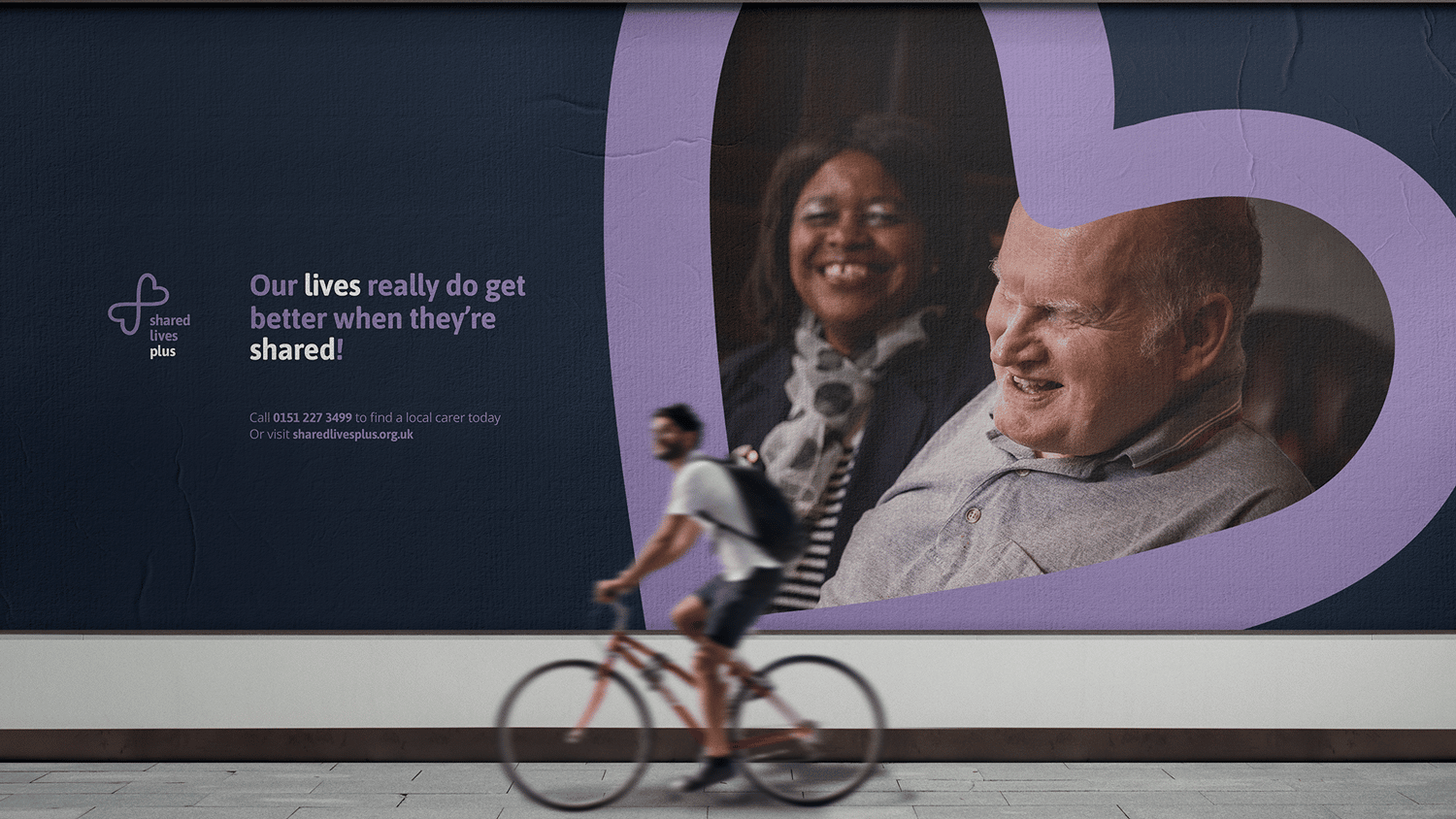
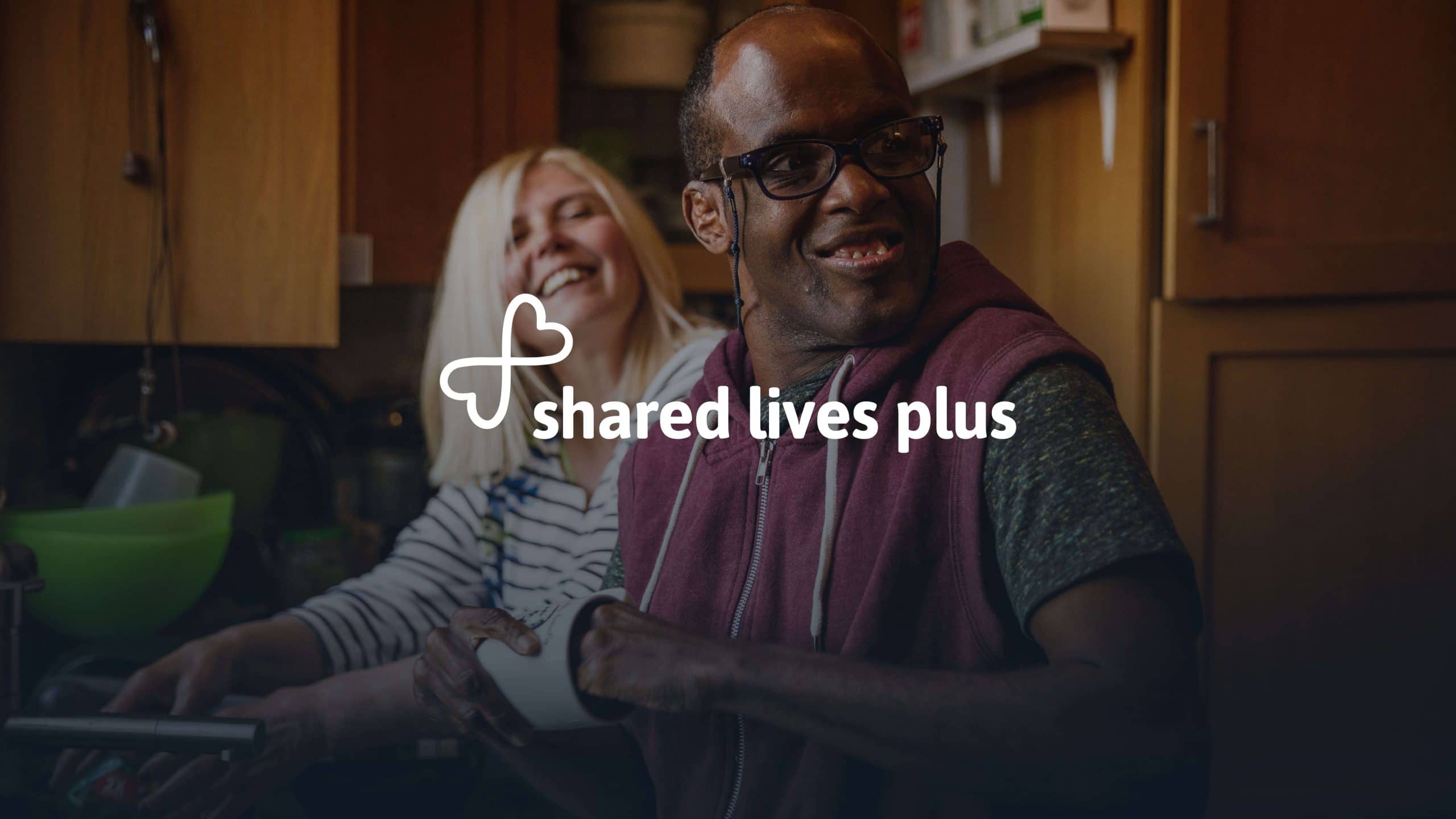
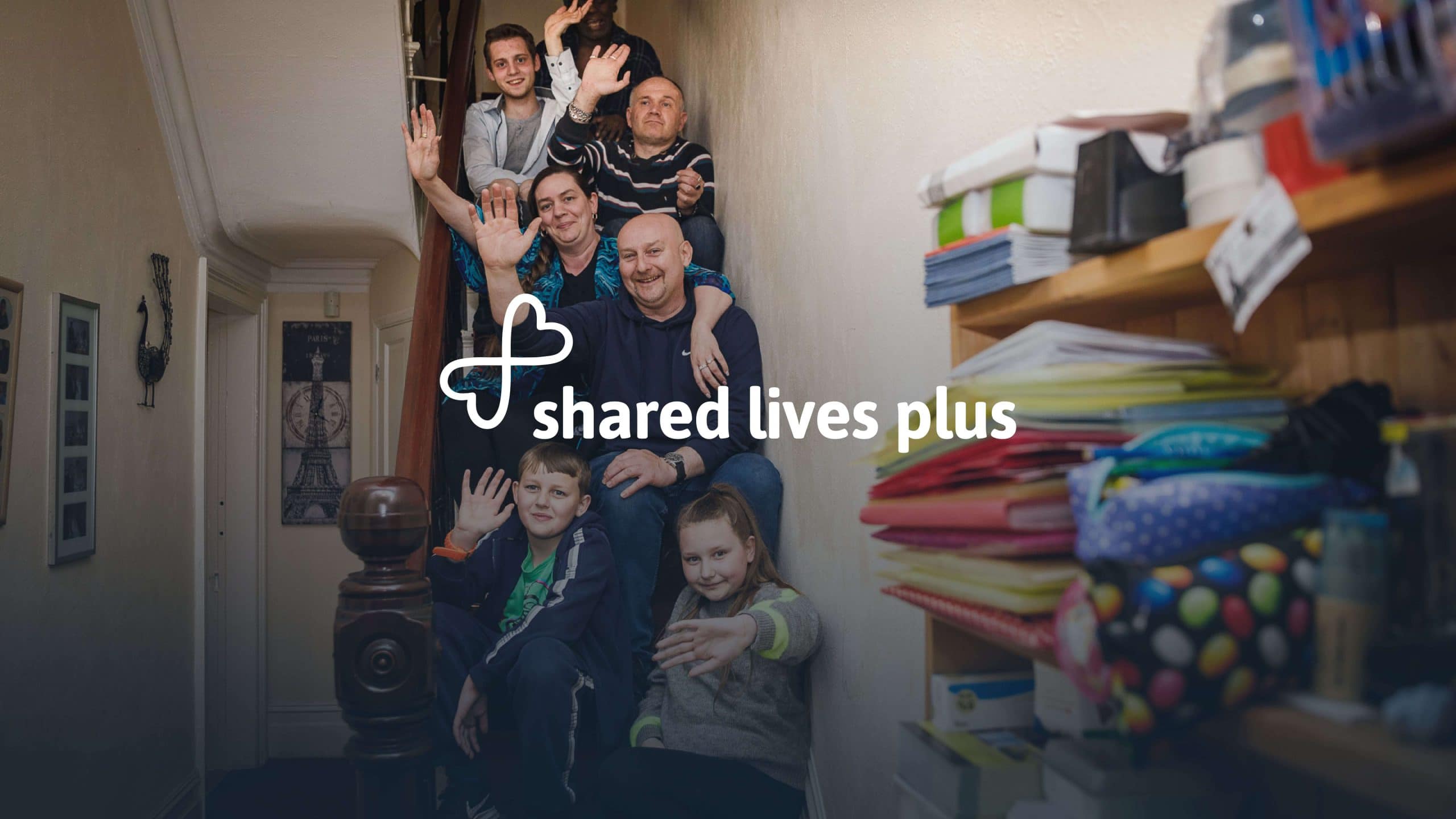
An important component to the initiative was how the visual language can aesthetically flex across surfaces and touch-points within the organisations communications landscape.
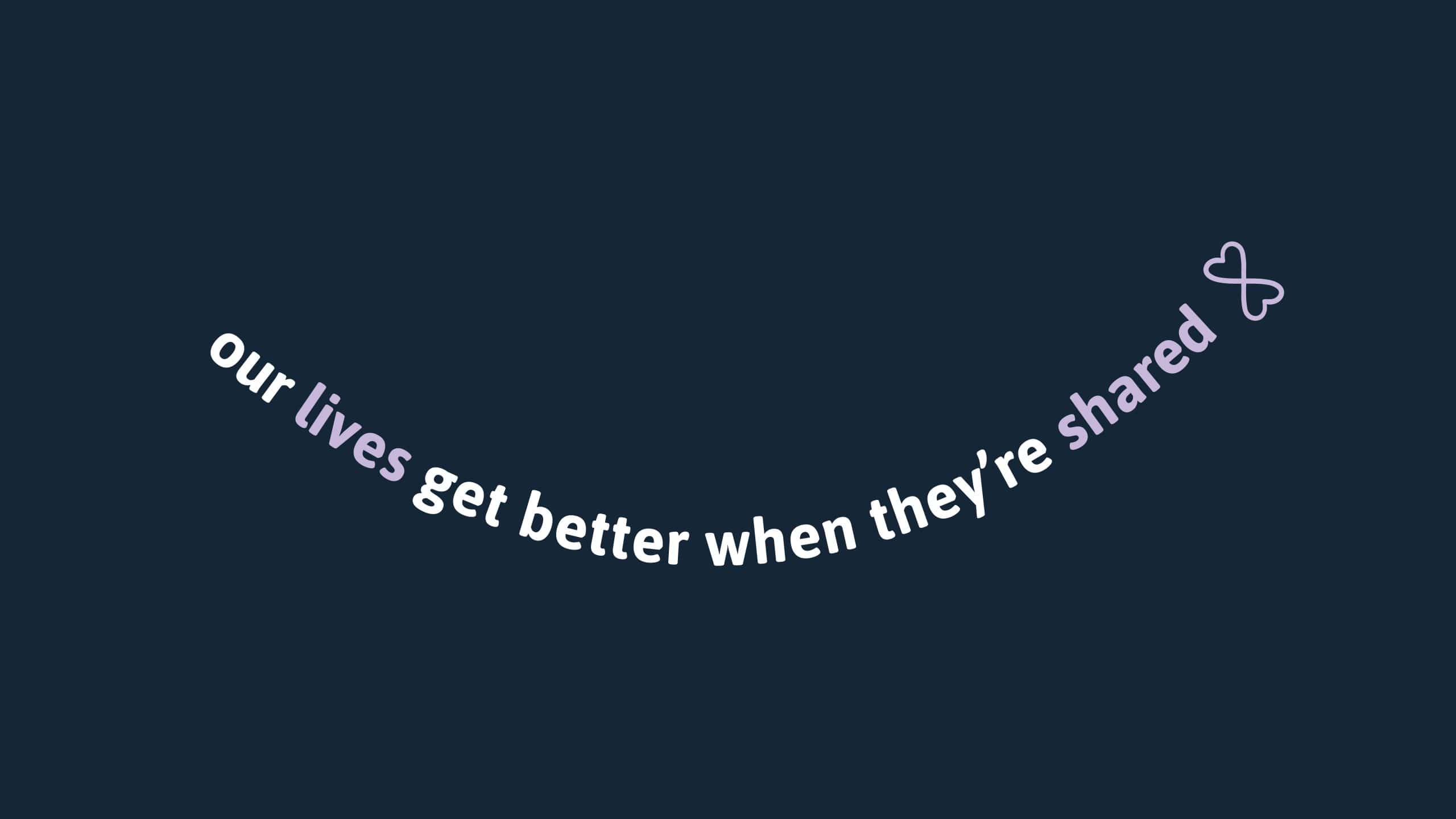
Kind language married to softer tones gently placed on rounded visual devices communicates to a wonderfully altruistic audience that it takes the issues at hand immensely seriously by acting sensitively, responsibly and with approachability.
The new and revitalised brand has empowered the organisation to influence government decision making and stakeholder advocacy.
It's network has grown in the thousands and it's social care recruitment drive has also seen growth in the hundreds.
Invite us to pitch, tender or consult. We'd love to get to know you. We are passionate about seeing your potential as an organisation reached.